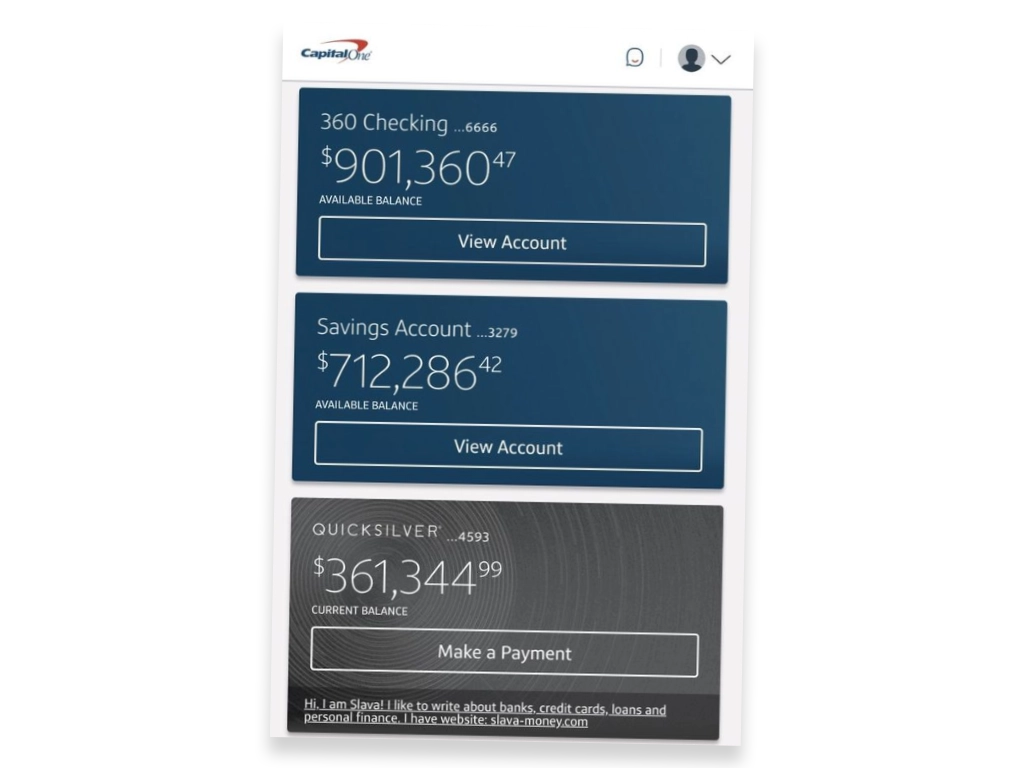
Screenshots of bank account can help you decide whether you should open bank account or not. Since you are going to see user interface of your bank a lot it is worth spending some time checking if it is OK to you.
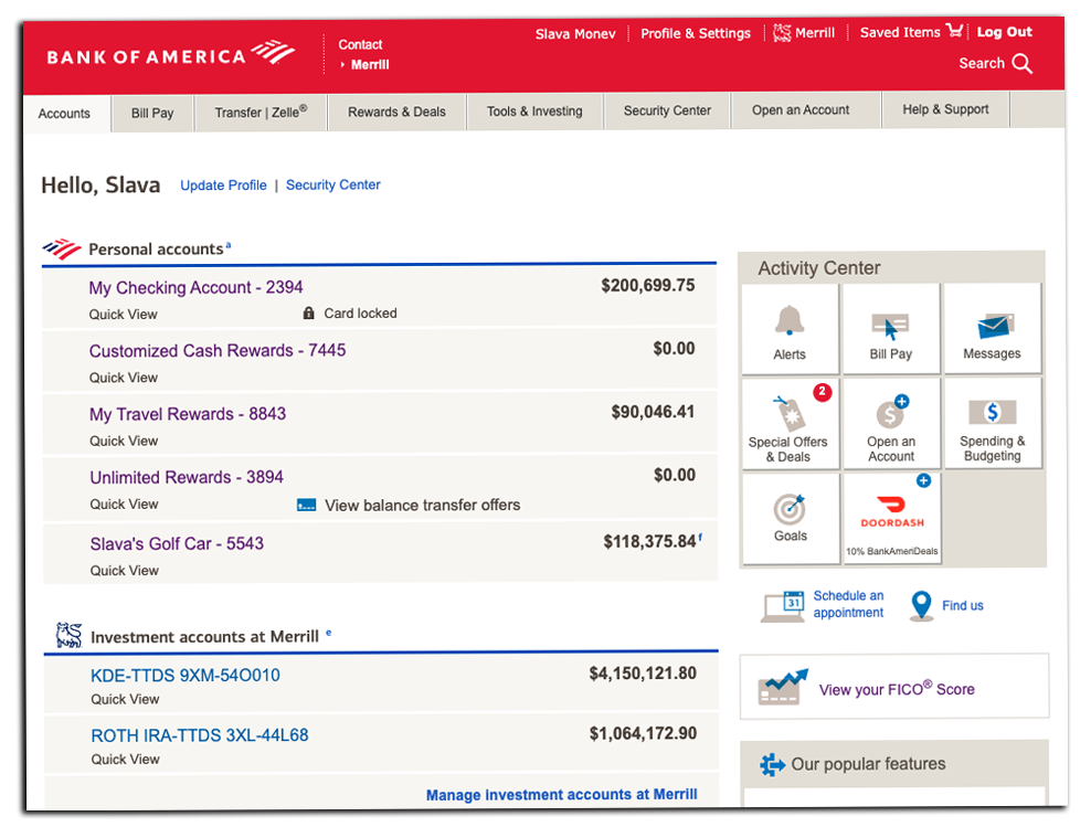
For example, screenshot of Bank Of America bank account, tells you that its designers must be earning very little money. How else can they keep this outdated user interface? Screenshots of bank account balance shouldn’t fit everything on the same page.
Seeing balance of checking account, credit cards, and loan is important, but other elements can be moved to some internal pages.
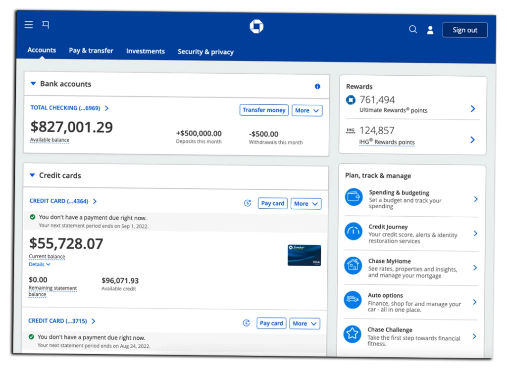
Screenshot of Chase account with balance also looks crowded. It badly needs a good designer. Amount of information that is not needed at the moment just explodes my mind. Information about Total Checking account and how much money it has is important, but information about deposit and withdrawals are not needed. The same can be said about Chase credit accounts. Section on the right side is overcrowded with information that is rarely used if used at all.
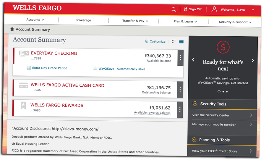
Screenshot of Wells Fargo bank account balance shows poor design choice. Placing so much not need information on the same screen is not needed. Seeing high balance of everyday checking account and active cash credit card makes sense. Right side bar makes no sense here.
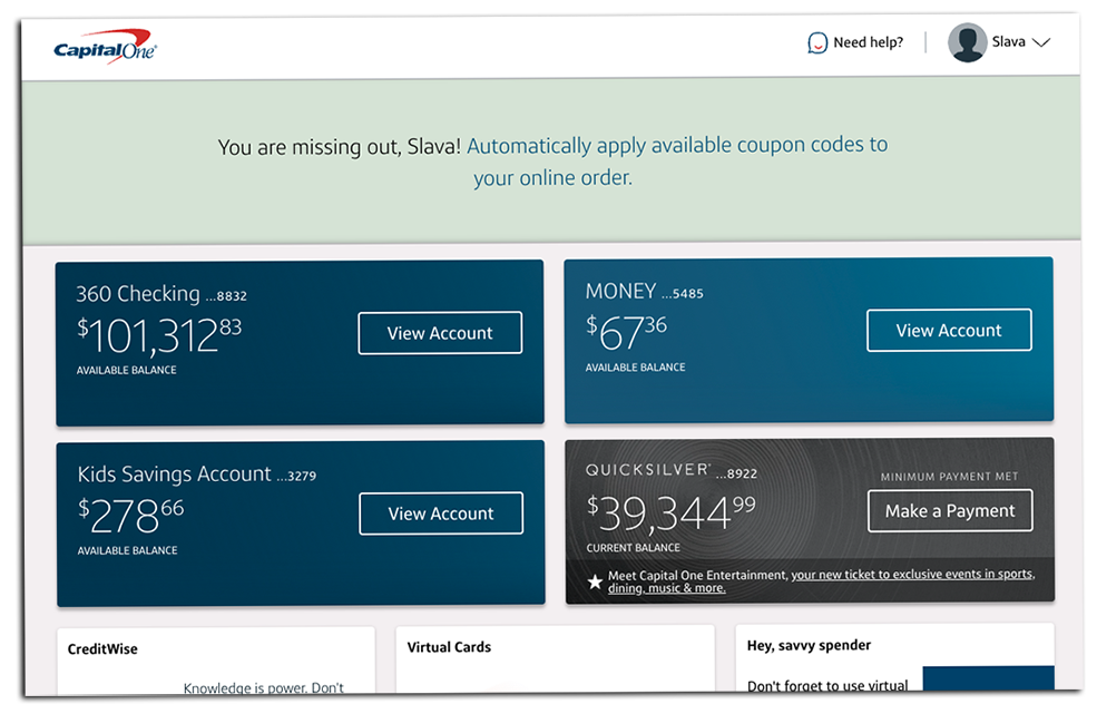
In contrast UX team of Capital One did a very good job. Space of dashboard is used effectively. They even found some space for CreditWise.
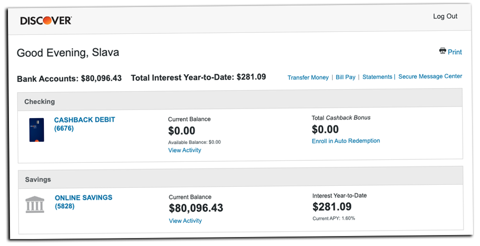
Screenshot of Discover Bank account looks not as good as Capital One’s, but definitely way better than screenshots offered by Bank Of America and Chase.
As you can see, accounts with the best user interface are offered by Capital One and Discover banks. Big banks like Chase, Bank Of America, Wells Fargo are pure disappointment.
